This is the first of a two-part series where Sandra generously shares her wealth of experience on how to go about choosing a journal for penwork such as Zentangle. In Part 2 of this series later this week, Sandra reviews several journals and comments on their attributes.
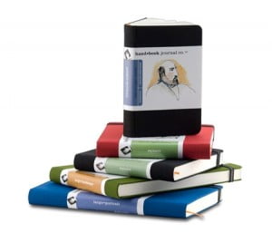 Choosing a journal is similar to choosing a puppy. They are all so precious. Flashing those beautiful prints, and fancy bindings. It’s hard to resist any of them.
But like a puppy, a journal is going to be your companion for a long time. You want one that fits your lifestyle, encourages you to keep going, and adds enjoyment to your work simply by being there.
Personally, I cheat and try to buy one of every journal ever made. I’ll admit this isn’t practical or economical, but it gives me an advantage. I can help you decide which you might prefer. I use permanent ink pen, water-based ink pens, and brush pens, so you’ll need to do more research if you intend to use fountain pen, watercolor, pastel or any other media.
Rule of thumb: If a journal is high-quality, the manufacturer wants you to know it, and will list very specific information on the label. If the wording is sparse and simply assures you that you’ll enjoy your journaling experience, chances are you won’t. A good quality journal isn’t necessarily expensive—you can find many under $20.00. If you go soft-bound with fewer pages, you can get them as cheap as three or four dollars.
Before I list any specific journals, here are some general things to look at when a journal jumps off a store shelf and begs to be taken home.
Open it in the middle.
Does it lie flat or nearly so? Is the binding likely to interfere with the sweep of your hand?
If a binding is stiff or tight, no matter the quality, you’ll probably get highly curved pages in the middle of the journal, and lots of spring to the sheets. Double-page spreads will not be possible. You may end up fighting the pages to keep them from flipping over.
Is the journal stitched or glued?
Glued bindings seldom lie flat, and are prone to cracking. Stitching is better but examine it. Uneven or loose stitching may not hold up.
What is the paper like?
Thick, thin? Glossy, matte? Can you see texture—lines indicating the grain, or small bumps? Is the texture even? When you run your finger across the paper, does it feel slightly gritty? Does the label have words like watercolor, pastel, pen & ink, scrapbooking? Does it include information about the paper? 72lb? 90lb? Cotton? Handmade, hand-bound? Italian? French? Lokta?
Thin isn’t bad. It weighs less, but is also more likely to curl, and allow ink to bleed through. Thin is lighter, which is much appreciated when you carry a journal on your travels. The glossier your thin paper is, the less bleed. Lokta paper is made from a renewable shrub, and even the thinnest is very durable, with little to no bleed.
Thick paper can be sturdier, but is more likely to have tooth—the aforementioned texture. 72lb paper is medium weight. 90 lb. is pretty thick, and anything above that is awesome. However, awesome or not, it weighs more than a brick and isn’t great for traveling.
When you have texture, then your pen line is not going to be as bold and crisp. Very smooth, glossy paper will give the darkest, boldest line. But the slightly broken line you get from faint to medium texture can be more interesting. The ‘official’ Zentangle tiles are made from a high-quality print-making paper and do have tooth. Handmade papers are likely to have uneven texture. That means your line work is going to be uneven and might even blotch. If you have experience and know what you are doing, you can get some fabulous effects on paper like this, but it isn’t for the faint of heart.
A journal with ‘watercolor’ or ‘Pastel/Charcoal’ paper probably has too much tooth for pen. If it says ‘Pen & Ink’ then it’s good for pen, but the paper will be thin and may curl easily. But if your thing is stark black & white, with little to no shading—pen & ink is your best choice. You don’t know what you are going to get with scrapbooking paper. It’s fun to use with gel pens, but may be too harsh for permanent or water-based ink pens.
Paper made of cotton rag or a high percentage of cotton is a good choice in textured paper. As with food, ‘Italian’ and ‘French’ usually means good stuff.
Does the label information include words like: archival, lignin-free, or acid-free?
Do you hope to keep your journal forever? Intend to fill the pages and then give it as a gift? Then you’ll want something labeled with the above words.
If you are looking for a practice journal, and intend to toss it in a corner when you are done, then non-archival is usually cheaper and will do the job.
* * *
Read Part 2: “Journals I’ve Known and Loved“
|
.oOo. |
|
Enhance your Zentangle experience while supporting TanglePatterns: |
|
BRAND NEW! TanglePatterns.com TANGLE GUIDE, 2026 Edition |
|
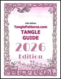 |
The 15th Edition of the TanglePatterns.com TANGLE GUIDE is an instant-download 123-page interactive digital eBook/PDF containing over 2,300 tangles on the site from May 2010 through December 31, 2025. It's a great resource and a must-have digital tool for using the site. Visit the STORE > E-BOOKS page and help keep TanglePatterns.com going by getting your copy now! |
|
"Linda, Thank you! I was relying on too few and getting stuck after 3 years of daily working with Zentangle. This has inspired me to ‘begin again’ with renewed excitement." ~ Barbara R. |
|
| See the BOOK REVIEWS page for more details on its features and view a sample page. Note: this is a digital product to download immediately when ordering, nothing will be physically mailed to you. | |
| If you're new to Zentangle® and tangling, my TanglePatterns.com BEGINNER'S GUIDE TO ZENTANGLE is just what you need to get started. Also available en Français and en Español. | |
|
|
|
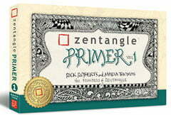 |
This is the only Zentangle book you'll ever need: the fabulous Zentangle PRIMER Vol 1. It's your CZT-in-a-book by the founders of Zentangle®. For more about the content and to read the rave reviews, visit the BOOK REVIEWS tab. |
| Available in KINDLE format for $9.99. Spanish Edition here. Japanese Edition here. | |
| "Absolutely the best Zentangle Book yet! As an accomplished artist I used to think I did not need instruction on this art form. How wrong I was! My tangling improved by leaps and bounds after reading this book. If you think you have Zentangle down then you need this book more than ever!" ~ Kris H | |
|
|
|
|
.oOo. |
|




I enjoyed this post and look forward to the next. I am a beginner. I do most of my tangles in an unlined Moleskin journal that I bought in an art supply store. I like the feel of the cover and paper. I have a smaller journal in which I keep patterns.
Good article! I use Windpower Watercolor in the spiral bound 9 x 6″ (I think) size. There _is_ a fair amount of texture, and the color is just a smidgen off dead white, but I like the weight of the paper (140lb)for permanent work.
You make good points that I hadn’t thought about in terms of the physical construction of journals and sketchbooks. I think spiral bound is best, but not often pretty. You are also right that sketchbooks/journals jump off the shelves – I can’t seem to keep those suckers away from me! 🙂
Thanks Sandra. There’s a lot more to consider about getting a journal than I realized. I hope to buy one soon. Now I know what to look for!
Thank you for all your hard work in getting this posted, Linda. It looks great! I was on jury duty yesterday, and then had to take my mother shopping, and I was dying all day, to get home and take a look at this. It was worth the wait!
🙂 Thank YOU for sharing these great tips with us, Sandra. I, for one, feel much better armed and less intimidated when I go looking for journals. This is SO helpful!!
With Christmas coming and tangle gifts to be bought, this article came at just the right time!!
This article was a big help-I waste too much time drooling all over the beautiful journals. So it’s great to know how to narrow down the choice! Thanks for the great article!
Great article!
I prefer Clairefontaine 90g paper for drawing. It hasn’t much tooth and it’s fountain pen friendly as well as Sakura Micron friendly. The Quo Vadis Habana blank journal is my favorite.
Thanks so much for this article. Now I boldly get drawing in the Lokta journals I’ve been saving. The pages are very thin, so it’s good to know the paper is unlikely to bleed (I’ll slip scrap paper underneath, just in case).
I’ve been using a very smooth heavy inkjet paper, mainly because I have a lot of it: Hammerhill Color Copy Cover, 60 lb. Cut in half, it makes a nice size: 5.5 x 11 inches. The surface is very smooth; ink just glides along on it. I’m looking forward to your article reviewing specific journals!
Oops! The half page is actually 5.5 x 8 inches.
(You probably figured that out.)
And I *will* boldly get drawing, instead of omitting verbs!
Thanks Sandra! All this information is so helpful. I went out looking for journals, and I was overwhelmed with all the different choices. I appreciate the knowledge you have shared with us!!
Trish