Linda’s Introduction: I’m delighted to add this new feature, “Guest Contributor”, to TanglePatterns.com. And I’m even more pleased that Cindi Allen accepted my invitation to be the first. And without further ado, over to her …
![]() My name is Cindi and I am a Tangle addict. Guess that’s the way to start out, isn’t it? Well, a Tangle addiction is so much better for our health and well-being than many other things!! I’ve been Tangling since September but have learned so much in that short time! To say I’m honored, as a beginner, to be asked to be a Guest Contributor on TanglePatterns.com is an understatement.
My name is Cindi and I am a Tangle addict. Guess that’s the way to start out, isn’t it? Well, a Tangle addiction is so much better for our health and well-being than many other things!! I’ve been Tangling since September but have learned so much in that short time! To say I’m honored, as a beginner, to be asked to be a Guest Contributor on TanglePatterns.com is an understatement.
Like lots of you, I find inspiration online – especially on Flickr and other photo-sharing sites. Search for Zentangles and – voila! – hundreds and hundreds to admire. I finally decided to be brave and put some of my Tangles on my Flickr account . But I’m not having much luck in the look of my uploads. I was hoping for a little help from my friends!
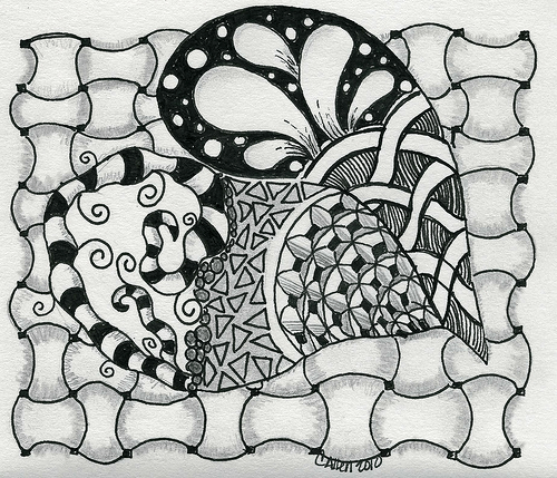
The uploads seem to have a bluish tint background where the white paper is, the black isn’t a great black and the shading doesn’t show up nearly as well as it does in the original picture. Here’s an example:

I look at other tangles on Flickr and many look as though they have no background at all, as if they are just floating on the screen. How do you do that?!?!? Are you taking pictures of your tangles? Scanning them? Preparing and editing them in a photo program such as Photoshop? Does the paper you use make a difference? The pens? A few helpful hints on preparing and posting pictures to Flickr (or other photo-sharing sites) from those who have had good luck with this would be terrific.
As a side note, I want to thank you, Linda, for making this website possible for all of us. You have created an ambiance of comfort and camaraderie. Whenever I visit it’s like I’ve opened the door to friends sitting around a huge kitchen table with their coffee and sketchbooks! While it looks effortless, I know this website must take a lot of your free time and a LOT of energy to scour the internet, looking for patterns and articles we would be interested in seeing. You allow us to spend our time tangling instead of searching, and I thank you. You will have my continued support to keep up this great website, and I hope others will join me in thanking Linda for all the hard work she does to make it easy for us.
|
.oOo. |
|
Enhance your Zentangle experience while supporting TanglePatterns: |
|
BRAND NEW! TanglePatterns.com TANGLE GUIDE, 2026 Edition |
|
 |
The 15th Edition of the TanglePatterns.com TANGLE GUIDE is an instant-download 123-page interactive digital eBook/PDF containing over 2,300 tangles on the site from May 2010 through December 31, 2025. It's a great resource and a must-have digital tool for using the site. Visit the STORE > E-BOOKS page and help keep TanglePatterns.com going by getting your copy now! |
|
"Linda, Thank you! I was relying on too few and getting stuck after 3 years of daily working with Zentangle. This has inspired me to ‘begin again’ with renewed excitement." ~ Barbara R. |
|
| See the BOOK REVIEWS page for more details on its features and view a sample page. Note: this is a digital product to download immediately when ordering, nothing will be physically mailed to you. | |
| If you're new to Zentangle® and tangling, my TanglePatterns.com BEGINNER'S GUIDE TO ZENTANGLE is just what you need to get started. Also available en Français and en Español. | |
|
|
|
 |
This is the only Zentangle book you'll ever need: the fabulous Zentangle PRIMER Vol 1. It's your CZT-in-a-book by the founders of Zentangle®. For more about the content and to read the rave reviews, visit the BOOK REVIEWS tab. |
| Available in KINDLE format for $9.99. Spanish Edition here. Japanese Edition here. | |
| "Absolutely the best Zentangle Book yet! As an accomplished artist I used to think I did not need instruction on this art form. How wrong I was! My tangling improved by leaps and bounds after reading this book. If you think you have Zentangle down then you need this book more than ever!" ~ Kris H | |
|
|
|
|
.oOo. |
|


This new feature will be a good one. I too, have just been “tangling” since September and am totally entranced by the art form. I do not blog,(although I read some of my favorites). However, would love to contribute to this feature. Linda; will we be able to email you a tangle or two for possible inclusion here?
JudyC
Hi Judy, I confess I had something different in mind for this feature but I think your suggestion a good one and one that Cindi actually brought up with me in our email correspondence.
However, BEFORE you all start emailing me your tangles please give me time to think this idea through for its best implementation.
I would really like to keep the discussion on this post to Cindi’s inquiries about scanning. So if you’d like to share your ideas and suggestions on Judy’s inquiry, feel free to email me: linda [AT] tanglepatterns [DOT] com and we’ll take it from there. Thanks so much!
Hi Cindi,
I get the best scanned results by laying my paper so it’s not touching the edges of the scanner window and by laying another sheet of white paper over the top of the sheet to be scanned (the top sheet needs to be larger than the paper being scanned).
I scan at a higher resolution than I need, save that, then copy to a new file.
With the new file I adjust brightness and contrast levels until they suit me. (For me this sometimes means increasing the brightness and contrast and sometimes means decreasing brightness and increasing contrast.)
If I’m working in black and white and seem to have a blue or green tint, I change the image to grayscale, then increase the colour back to full colour. That eliminates unwanted colour.
When I’m happy with the image, I save this 2nd copy full size, then save it again as a smaller file for uploading.
I use Paint Shop Pro for editing images and scan with a Lexmark.
Yes, paper and pens do make a difference, but you can make the images pop more by adjusting values.
Hi Cindi. I was photographing my pieces, but like you got frustrated with the inevitable shadow caused by this. I moved to scanning, but found that it was to harsh, and my shading seemed to get lost. This is where I am at now… I scan on a custom setting of about 400dpi, and I lower the contrast and brightness just a touch to combat that harshness. In some you can still see the background, but I am getting to a place where I am happier with the posted results.
Looking forward to others contributions.
Cindi,
Be sure you are scanning it as a black and white image, and not a color image.
Some scanners have a setting for text (in addition to the black and white setting). That has been useful for me when I’ve scanned images created on tissue or tracing paper.
Hi Cindi
I scan my tangles using a Lexmark scanner/printer with the following settings:
Color Depth – black and white
Scan Resolution – 75 dots per inch
Select area to be scanned – Letter
I then crop it in Photoshop and add a black outline as a frame just because I think it sets off the tangle.
I find this works fine for posting on Flickr.
As someone with considerable publishing experience both in print and online, I recommend scanning at a higher dpi – you’ll get crisper, cleaner results.
A low resolution gives a pixelated image and your lines will not look their best. I’d suggest 150 as the lowest, 200 even better. You can go as high as 300dpi for glossy magazine-quality images, but the bonus is that you’d have the best quality digital record of your artwork.
Then, for whatever resolution you choose, you should resize (“save for the web” in Photoshop) so the file isn’t humongous. You get a much better result than initially scanning at a lower resolution.
And, as Carys points out above, always work with a copy of your scan and preserve your original file. Then you have something to go back to if need be.
Also if you scan with a black sheet laid over your image (place image on platen, then place black sheet over that) you get very clean results and an instant “border” of your choice of size when you crop the image to save it for uploading to the web.
Wow! Thanks for all the wonderful suggestions!! I’ll be playing around with my scans now. Hopefully I can come back with some sweet-looking pictures….
Man, I love this site!
I’ve been scanning my pics at 400 dpi. Is that TOO high? Should I lower it a bit?
It’s not really necessary but there’s nothing wrong with it. It’s the low resolution that I wouldn’t recommend. A very high resolution will make very large files but that just becomes a disk space issue more than anything else.
I have an Epson flatbed scanner and set it for a grayscale illustration at 300 dpi. Then I open a copy of the scan file in Photoshop, select the part of the image I want, and save that selection as a new file. Then I resize the new file to the pixel height and width I want and save that for the web. The final image is 72 dpi graphic that’s crisp and clear. That’s how I process all of the graphics for tanglepatterns.com.
But there are always many ways to accomplish the final product, so other readers may have a better one??
Oh yes, the more the merrier! I’ve already got a page of paper with notes jotted. I’m going to try them all!
If you’re bringing the file into Photoshop, you can try the noise filters. Despeckle in particular is great for cleaning up any little, well, speckles, on the background, and the Dust and Scratches filter with really low radius settings can clean up any jaggies on your line work.
I use both of those a lot when I’m restoring vintage engravings for publication.
Thanks Rebecca, I do use Photoshop Elements. I’m no pro at it, and have used those two filters when cleaning up old pics, but didn’t think about using them for this!
I’m so late in responding with how this all worked for me! My images look so much better now. Camilla, you had the best hint of all – copy them as a B&W image instead of color. No more blue background. When coupled with nzjo’s suggestion to lower the contrast and brightness – instant sucess! And Linda, I will always listen now – I didn’t work with a copy on one picture and lost it 🙁 Had to start all over again. Laying the black background on top of the photo gives it a great frame really sets off the picture, too
Thanks for all of your hints!!
Hi Cindi
I use a program call Bibble (not free, but not expensive (pro is $200, regular is $99, and there is a trial version too) to clean up my photos of all my art. Since my ZIA always have colour in them, I find I have the best luck adjusting the colour, by adjusting the “white balance”. So, photograph the art with a bit of white paper showing on at least one edge (put white paper under your art if it goes right to the edges). Then in Bibble, I select the white balance adjustment,and “sample” the white paper behind my art. It adjusts the rest of the colours perfectly 99 out of 100 times. Plus, I can use other adjustments mentioned above. Linda’s instructions for re-sizing the image are great. I use ACDSee for that part of the job, but there are lots of other programs that will allow you to do that too.
Here is the link to Bibble; I really can’t recommend it highly enough. It can do amazing things: http://bibblelabs.com/
I just wanted to share that I found an iPhone app that is really handy with my tangles. I don’t have a scanner, so I photograph my work with my phone with unsatisfying results. I found this app called scanner pro, and it was 1.99. It captures your work with the iPhone camera. I just thought others might make good use of it :).
thank you thank you thank you!